| ← Август 2009 → | ||||||
|
9
|
||||||
|---|---|---|---|---|---|---|
|
16
|
||||||
|
22
|
23
|
|||||
|
29
|
||||||
За последние 60 дней ни разу не выходила
Сайт рассылки:
http://popsop.ru/
Открыта:
22-05-2008
Статистика
0 за неделю
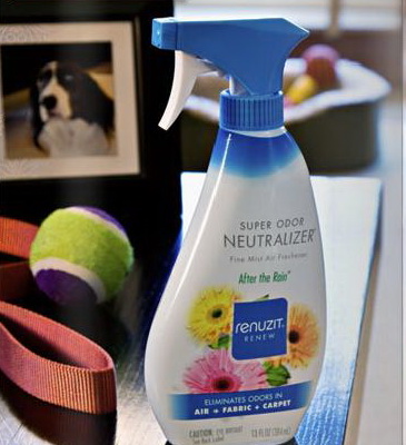
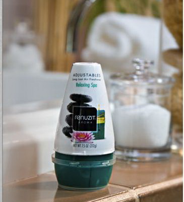
Popsop.ru. Дизайн упаковки. Дизайн бренда Renuzit: fresh positioning for air fresheners
Dial Corp., which claims to be the leader in its segment,decided to move to new visual positioning of Renuzits fragranced products in order to differentiate them on retail shelves.
During researches, the company found out that consumers associated the cone shape of the Adjustables-style deodorizer with Renuzit. The problem was they were unaware of other brand offers. The task was set to capture the essence of the Renuzit consumer with the help of interviewing and prompting and to use the information in developing a new brand identity. After completing eye-tracking studies, the team settled on two designs. A square, black-colored logo was chosen for Renuzit Aroma products (that put odors into the air). A square, light-blue-colored logo and a light-blue-colored band at the bottom of the label that says, Eliminates Odors were meant to differentiate Renuzits odor-elimination products.
Здесь можно оставить свои комментарии. Выпуск подготовленплагином wordpress для subscribe.ru |
| В избранное | ||